Advice for Using the Color Orange in the Garden
Garden designer Victor Lazzari provides his best advice for using the color orange in the garden. Don’t shy away from this tricky hue; make it work!
I’ve been a professional landscape and garden designer for over 20 years now, and for most of that time I have actively avoided using the color orange in the garden, both for client projects and at home.
I’ve just never liked the color. As a young gay boy I associated it with things I found boring or depressing: traffic cones, safety vests, construction signs and (worst of all) sports equipment. Moreover, my favorite flower colors have always been feminine pinks, fuchsias and magentas. These all more or less go together, and orange flowers generally clash hideously with them.
Recently, however, I’ve accepted that my dislike of orange needs to end.
Part of this truce is because orange flowers are so prevalent in South Florida, where I’ve lived, gardened and practiced design since 2007. By actively shunning orange, I miss out on a lot of cool plants!
But there’s a bigger reason for me to make my peace with this color: Most orange flowers are highly attractive to bees and other pollinators, either by design or coincidence, and these creatures need our help now more than ever before. Embracing more eco-mindedness in design and plant selection isn’t asking too much of any of us, myself included.
Understanding orange as a garden color
Like any other hue, not all oranges are created equal. The color encompasses everything from the ghastly traffic cones and Nerf footballs of my youth to more congenial floral tones like apricot, peach and melon. And variables like flower shape, petal opacity and the presence or absence of other colors in the inflorescence—further affect how orange registers to the human eye. (Read tips on using multicolored flowers.) But to simplify things, here are a few basic principles remember when using the color orange in the garden:
1. Recognize that orange is an inherently exciting color, easily the most energizing part of the color wheel. For this reason, orange flowers would be a poor color choice for, say, a serene meditation garden, but wonderful in a children’s learning garden or an active family’s back yard.
2. Because orange is one of the hot colors (along with red and yellow), it always looks best in full sun and midday light. In the muted light of dawn or dusk, or in shady locations, orange—especially really deep oranges—will recede into the background and be minimally noticed, which may not be the intended effect.
3. Like any other color, orange can be either harmonized or contrasted, depending on what you pair it with. Harmonies are simply any three adjacent colors on the color wheel—for example, the continuum of pure orange to yellow-orange to pure yellow. Contrasts are any two direct opposites on the color wheel. In the case of orange, the opposite is blue.
To illustrate this point, picture clumps of orange lilies and yellow marigolds surrounding the yellow-orange blend of ‘Gold Medal’ grandiflora roses. This combination works well largely because the three flower colors are so obviously similar. Now imagine keeping the lilies, but switching out the roses and marigolds for blue salvias or plumbago. A rousing blue/orange contrast now replaces our yellow-to-orange harmony.
Excess color harmony quickly bores the human eye, yet too much contrast upsets it. So one effective means of using the color orange in the garden is to liberally pair it with warm hues in the yellow-to-cream range, while throwing in a shot of blue here and there to squelch any visual ennui.
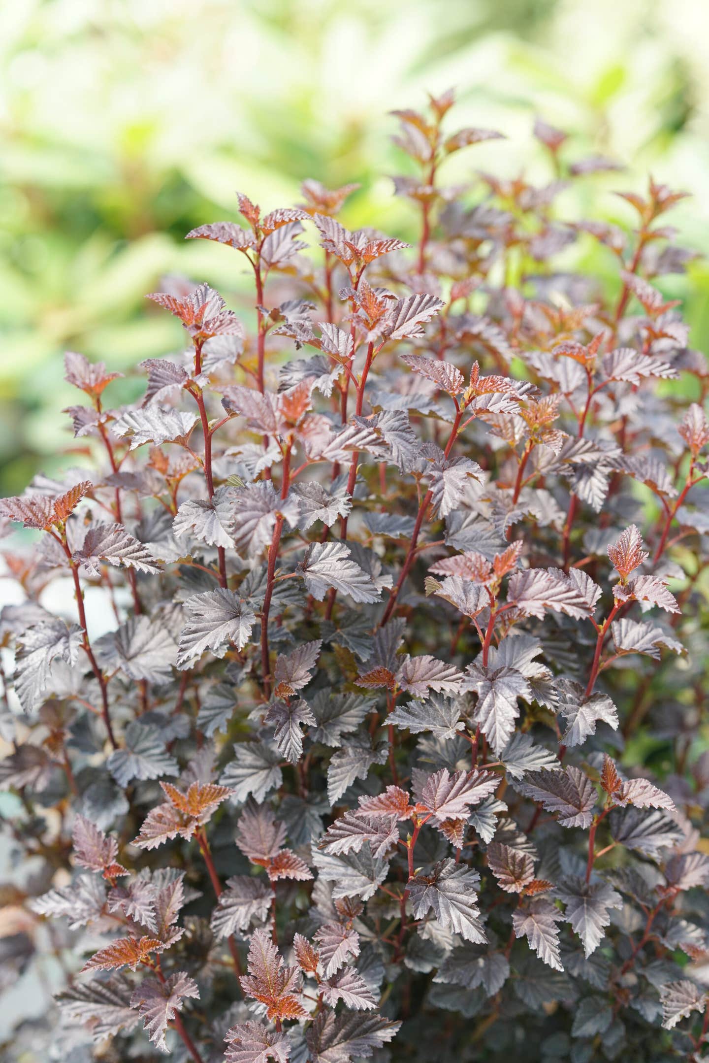
Another tactic is to juxtapose orange flowers with maroon, burgundy or blackish foliage. those dark, subdued leaf tones perfectly accent and highlight orange blooms, while simultaneously toning down their heat.
4. As I mentioned earlier, magentas and other cool shades of pink tend to look jarring with most oranges, so be careful placing these colors side-by-side in a bed. Try to stick to warm shades of pink—those with yellow undertones—alongside orange.
And on that note: Blended and pastel orange flowers will always play more easily with other garden colors than pure, deeply saturated oranges. The intense, screaming vermilion of Sweet Glow gerbera daisies, for example, is way harder to integrate with other colors than, say, bronze gazanias or peach daylilies. (Yet those same gerberas would create a dramatic and sultry focal point coupled with just the rich aubergine foliage of SolarPower Black ipomoeas.)


